In the first term the shelter project was set; landscapes and natural shelters were my initial thoughts. To start I went out and took several photographs of trees and woodland areas; I also collected conkers as a form of shelter. I began experimenting with my images; I played around with ideas of three-dimensional images. I investigated ‘pop-up’ images/paper-craft and ways to layer materials (papers) and drawing. I drew on top of my photographs with black ink and looked at various forms of shapes and silhouettes.
My interest in creating aesthetically pleasing/fascinating sketchbooks and using text as a background to drawing stems from my love of books and typography. As a very basic first step I made a small booklet to house my landscape photographs, which I grouped together in terms of tone, colour and light. After my experiments with three-dimensional paper-craft and ink, I created a slightly larger image by layering paper from dark colours to lighter, ending with white on top. This led me to create a ‘book’ from one image; I turned each layer into a separate page which I photographed. In the mid year review, I received feedback stating that this was the most successful work, as the photos look like stage sets.
The conkers I collected dried out and grew mould before I photographed them. It was this texture I looked into with the landscape images. I used tissue paper and paint to create similar textual effects.
During a tutorial it was recommended I go outside to draw and experiment. I drew some trees and branches whilst sat in the wind and rain; these drawings literally include the landscape. I photocopied the drawings in search of more contrast, and to draw on top of them also.
I began photographing and drawing branches as I felt the interest of texture would be more applicable to the detail of the branches rather than the tree or landscape as a whole. I combined previous experiments and ideas as the half year review exhibition approached to produce six images to exhibit. These images were collages and drawings; I collaged pieces of text, tissue paper and photocopies of my rain drawings on watercolour paper. I then painted branches and then I added detail and definition with black ink.
During the first couple of weeks of the project, some feedback suggested there was no direct link to the shelter theme. Yet as time passed and projects moved forward this criticism became less relevant as ‘shelter’ was only a starting point as projects developed. It was also suggested that I increase the scale of the images which I plan on doing with my work now. Despite trying to develop less controlled work with the rain drawings, I did end up producing something relatively controlled for the half year review exhibition. The idea of taking my work outside provided some new possibilities which I should consider and move forward with. Increasing the ambition of my work is perhaps the most important aspect I must apply to my practise in the upcoming months.
Sunday, 19 December 2010
Wednesday, 15 December 2010
The Tree of Life.
Artists' Interpretations of the tree.
 |
| Fallen Tree in Autumn Rain. |
Born in 1948 in Derbyshire, Michael Porter would have been surrounded by nature growing up; rolling hills, vast woodlands and an abundance of wildlife. So it comes as no surprise that his choice subject for painting is nature. Porter's 'Fallen Tree in Autumn Rain' in my opinion, is a lovely subdued, ever so slightly textual painting. The application of the oil paint is reminiscent of twigs, bark and leaves. If I didn't know the title of the painting, I think the subject of trees and natural surroundings would still come to mind. My favourite aspect of the artwork is the colours. Deep chocolate browns reflect on strong tree-trunks; combined with dusky pinks, greys and lilacs, conjures up imagery of a wet, rainy woodland during dusk on an autumn evening.
 |
| Tree of Life. |
American born John Hubbard lives and works in Dorset; an artist inspired by his natural surroundings. 'Tree of Life' is another oil on canvas painting. At about 1.5 metres square the scale is appropriately large for the subject and title. This is a busy and colourful piece of work, there doesn't appear to have a theme with the mixture of yellow, green, red, pink and purple. It is this lively and vibrant array of colour which creates the 'life' in the painting. The 'tree of life' is painted in a bright yellow, just as the sun is often portrayed in this colour, the sun being the provider of energy for all life on earth. The yellow tree is central with the many other colours - or the 'life' - around it or maybe coming from this providing tree.
 |
| Landscape No. 80. |
'Landscape No. 80' by John Virtue is made up of 30 small images - all different - in rows of 6. 15 of the 30 images are split into 4, creating another further 60 different landscapes. All in black and white, and drawn using the same media, their only difference is the view they each hold. Each separate drawing is a flurry of black marks and scratches; busy, hectic and unpredictable in appearance. The landscapes Virtue imagines is a dark, dense woodland with thin branches obscuring and stretching across any paths there may be. The title 'Landscape No. 80' means this particular work could be part of a series; perhaps a series of undefinable landscapes from the British countryside, exploring all of the possible views from each individual area.
 |
| Beach Fruit (detritus). |
This heavily textured painting by Terry Setch is made up of encaustic wax, paint, and what appears to be twigs and leaves. This use of actual part of the tree, in my opinion, counteracts the lack of any clear detail, as the viewer knows that twigs and leaves represent trees. Setch's 'Beach Fruit' is clearly highlighting a tree trunk form with white brush strokes. Reds, browns, yellows and olive green makes for a lush background; creating imagery of fruit and other plants and foliage. This work is made up of two canvases; the larger is of a Beach tree, and the smaller, thinner canvas seems to be of the fruit.
Friday, 10 December 2010
Landscapes in picture, collage and design.
This book is concerned with how to look at the rural landscape and record the views in collage, prints, drawings and paint. These are my favourite images taken from the book.
 |
| Silver Birch Trees. Sheila Tindley. |
 |
| Prints of various grasses and flowers. |
Tuesday, 7 December 2010
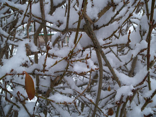
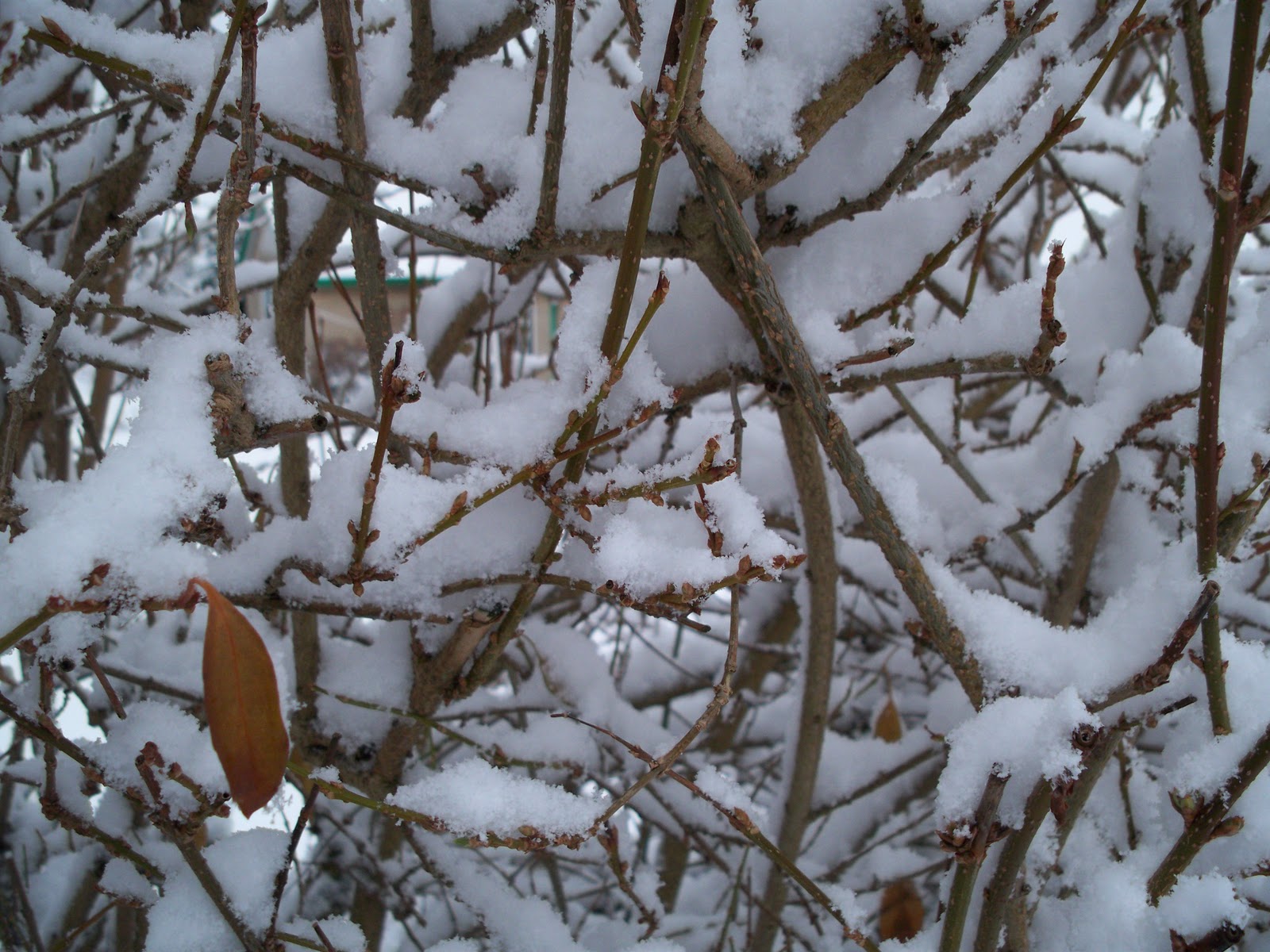
Snowy Garden.
It started snowing in Glossop about 2 weeks ago but as the temperatures hit below freezing every night there is still snow and ice everywhere. I haven't taken any photos this year but last winter I took loads of my garden at home.


Friday, 3 December 2010


Tuesday, 30 November 2010


Sunday, 28 November 2010


Saturday, 27 November 2010
Prints of the Rain Drawings.
To find a way of using the rain drawings in my work, I photocopied them to draw over. The photocopies show the ink darker and thicker than the actual sketches, which I like. The photocopier picks up any dark areas easier than thin or pale lines, which means there is greater contrast between the two. This is most noticeable on the first tree I drew.


Subscribe to:
Comments (Atom)